

If you’re in Australia and keen to decode the weather, you’re probably familiar with the term synoptic chart Australia. These charts are one of the best tools for understanding the big picture of weather patterns and making sense of daily forecasts. But what exactly is a synoptic chart, and how can you read one to understand Australia’s often unpredictable weather?
Let’s dive in and get a handle on what these charts are all about, why they matter, and how you can use them to stay one step ahead of the weather.
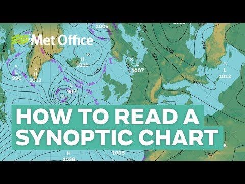
What is a Synoptic Chart?
Alright, so first things first.
A synoptic chart, also known as a weather map, is a graphical representation that shows the atmospheric conditions over a large area at a specific time. It includes essential information like pressure systems, fronts, wind directions, and precipitation. Synoptic charts are invaluable for meteorologists when it comes to predicting weather patterns and alerting the public about upcoming changes.
In Australia, synoptic charts are particularly crucial. The country’s vast size and varied climates mean that weather can change dramatically from one region to another. So, whether you’re planning a beach day or preparing for a potential storm, a quick glance at a synoptic chart Australia can provide essential insights.
How to Read a Synoptic Chart Australia
Reading a synoptic chart might seem like reading a foreign language at first, but it’s simpler than it looks. Here’s a quick breakdown of the basics:
- High and Low-Pressure Systems: You’ll see “H” and “L” marks on the chart. “H” stands for high-pressure systems, which usually bring clear skies and stable weather. “L” indicates low-pressure systems, which are often associated with rain and storms.
- Isobars: These are lines that connect areas of equal atmospheric pressure. When isobars are close together, expect strong winds. If they’re spaced out, it indicates lighter winds.
- Cold Fronts: These are marked by a line with triangles pointing in the direction of movement. A cold front brings cooler temperatures and often leads to rain and thunderstorms.
- Warm Fronts: Represented by a line with semi-circles, these fronts indicate warmer, more humid air moving in. They’re less common in Australia compared to cold fronts.
- Troughs and Ridges: Troughs, often marked with dashed lines, show areas of low pressure and potential unsettled weather. Ridges, marked with zig-zag lines, indicate high pressure and stable conditions.
Now that we’ve covered the basics, let’s dig into why these charts are essential for Australians.
Why Synoptic Charts Matter in Australia
Australia’s geography and climate make synoptic charts a must-have tool for understanding weather patterns. Here’s why:
- Diverse Weather Conditions: Australia experiences a mix of climates—tropical in the north, desert in the center, and temperate in the south. This diversity makes synoptic charts incredibly useful for tracking and predicting weather across the country.
- Bushfire Risks: Synoptic charts help forecast conditions like high winds and dry air that can exacerbate bushfire risks, especially during the Australian summer. Understanding high-pressure systems and wind directions is crucial for bushfire preparedness.
- Cyclone Tracking: Northern Australia is prone to cyclones. Synoptic charts help in tracking these systems, allowing meteorologists to provide warnings and give people time to prepare.
- Rainfall Patterns: With many areas dependent on rainfall for agriculture, knowing when rain is coming is vital. Synoptic charts can indicate upcoming wet periods or dry spells.
How to Use a Synoptic Chart for Personal Weather Forecasting
So, how can you use a synoptic chart Australia for your own needs?
It’s pretty straightforward. Here’s a quick guide:
- Check Pressure Systems: Start by looking for high and low-pressure systems. If there’s a high-pressure system near your area, you can generally expect fair weather. If it’s a low-pressure system, grab an umbrella.
- Watch for Fronts: Cold fronts often bring cooler temperatures and rain. If you see a cold front approaching, prepare for potential rain and storms.
- Look at the Isobars: Tight isobars mean windy conditions. If you’re planning to go out on a boat or have an outdoor event, this is something to consider.
- Pay Attention to Troughs: Troughs often signal unstable weather, which could mean anything from clouds to thunderstorms. Keep an eye out for these if you’re planning any outdoor activities.
Where to Find Synoptic Charts in Australia
Synoptic charts are widely available and easy to access online. Here are some reliable sources:
- Australian Bureau of Meteorology (BOM): The BOM website provides up-to-date synoptic charts for Australia, with forecasts and analysis. It’s one of the most reliable sources for detailed weather information.
- Weather Apps: Many weather apps include synoptic charts and other detailed data. Popular options include Weatherzone and WillyWeather.
- News Outlets: Major news channels and websites in Australia often display synoptic charts during weather segments, especially when severe weather is expected.
Common Questions About Synoptic Chart Australia
1. How often are synoptic charts updated?
Synoptic charts are typically updated every six hours. This allows meteorologists to provide the most accurate and up-to-date information.
2. Can I use a synoptic chart to predict the weather for specific cities?
Yes! Synoptic charts cover large areas, but they can provide insights into the weather patterns affecting specific regions and cities across Australia.
3. What’s the difference between a synoptic chart and a satellite image?
A synoptic chart shows atmospheric pressure, fronts, and wind patterns, while a satellite image provides a visual representation of cloud cover and precipitation.
4. How accurate are synoptic charts?
Synoptic charts are highly accurate for short-term forecasts, typically up to 3-5 days. For long-term forecasts, other data models are often used in conjunction.
5. Do I need special training to read a synoptic chart?
Not at all. While meteorologists use synoptic charts for detailed forecasting, anyone can learn to read the basics with a little practice.
Final Thoughts on Synoptic Charts in Australia
In a country with as diverse and dynamic weather as Australia, synoptic charts are an essential tool. They help us stay informed, prepared, and ahead of the game when it comes to changing weather patterns.
So, next time you’re curious about what the weather holds, take a few minutes to look at a synoptic chart Australia. It’s a powerful way to stay connected with what’s happening in the atmosphere, even if you’re just planning a weekend BBQ or a day at the beach.
There’s no need to be a weather expert to get valuable insights from a synoptic chart. With a bit of practice, you’ll be able to read the weather like a pro and understand Australia’s climate with ease.

